
Affinity Designer — Mac download
Download (779 MB) Earlier builds
Ticked
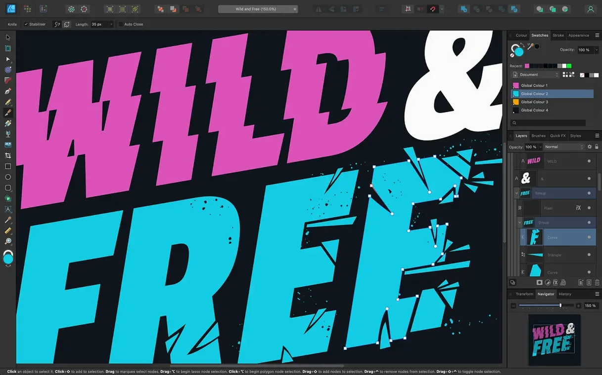
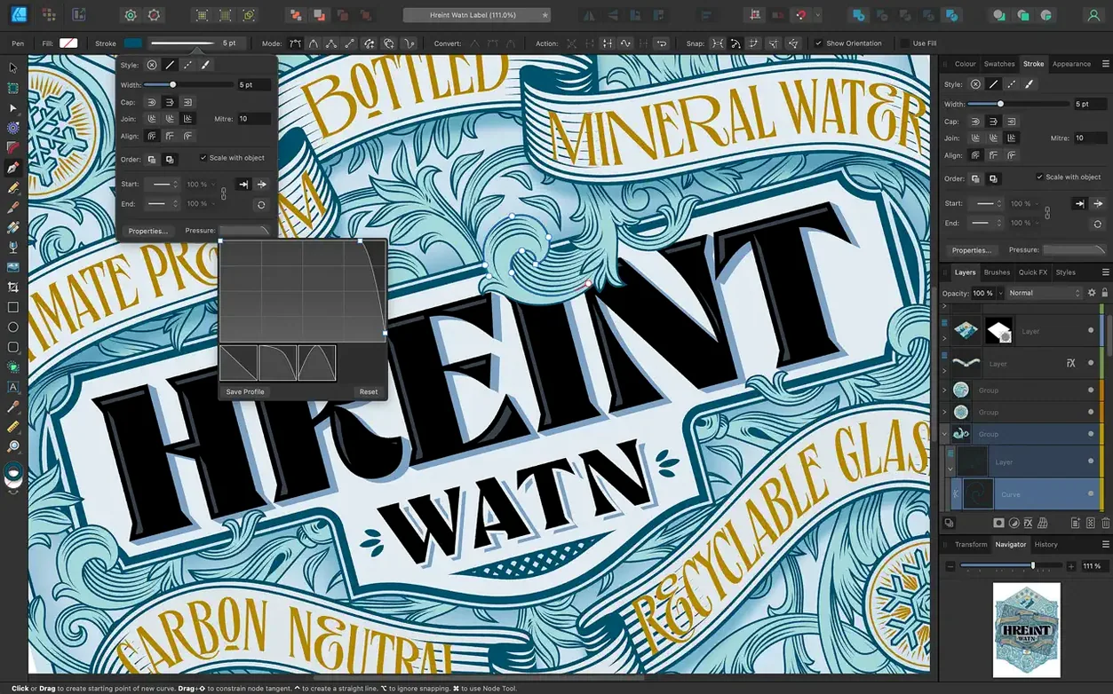
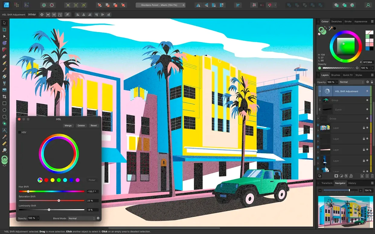
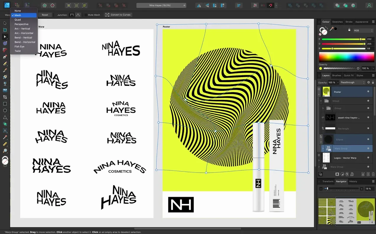
Version 2.6.5 mostly tightens things up: bug fixes, stability work. The 2.6 release earlier added the bigger changes — Pencil tool improvements, Stroke Width Tool profiling tweaks and a Reset Profile option, plus a Command or Ctrl toggle for marquee select intersection behaviour.
| Detail | Value |
|---|---|
| Version | 2.6.5 |
| Developer | Serif Labs |
| Colour models | CMYK, LAB, RGB, grayscale |
| File formats | PSD, AI, PDF, EPS, SVG, JPG, TIFF, EXR |
The standout features split into clear jobs. The Pencil tool's job is freehand drawing without wobble — brush and pencil stabilization smooth out curves as you work. The Stroke Width Tool profiles lines after they are drawn, and Reset Profile returns a stroke to an even weight. For colour work, 16 bits per channel editing keeps gradients clean across CMYK, LAB, RGB and grayscale. Text tools cover both artistic text and text frames, including text along a drawn path. Import and export run across PSD, AI, PDF, EPS, SVG, JPG, TIFF and EXR, so files move between apps without extra conversion steps.
Guides out first, always
You open the app and hit ⌘N. The new document dialog offers preset sizes — I pick A3 for a poster layout. First move: ⌘R to show rulers, then drag guides from the left ruler to mark margins.
I start with a rectangle for the background. Press M for the shape tool, draw it corner to corner, then hit the Fill swatch in the toolbar. A quick click on the gradient tab in the colour panel, and I drag two stops — deep blue to near black.
Now the title. I press T for the Artistic Text tool and click once on the canvas. Type the headline, highlight it, then open the Character panel for tracking and weight. The font previews render as I scroll — no guessing.
I need a curved subtitle, so I grab the Pen tool (P), draw a shallow arc across the top third, then switch back to Artistic Text. Click on the path itself — the cursor changes — and type. The text follows the curve. I drag the start handle to nudge it into position.
A logo goes bottom-right. I drag in an SVG from Finder, and it lands as editable vector layers. Double-click to isolate the group, tweak a few nodes with the Node tool (A), then click outside to exit isolation mode.
For finishing touches, I open the Layers panel (⌘⇧L) and reorder a few elements. The poster has three artboards by now — variants for different aspect ratios — and I switch between them with a single click in the Layers panel. Export via ⌘⌥⇧S to a preset that outputs all artboards as separate PNGs.
The whole session stays in one window. No floating palettes drifting off-screen. The toolbar adapts to the tool I'm holding, showing only what I need next.
Drawing blind on a locked layer
- Drawing on the wrong layer. The Layers panel shows whatever was last selected. Beginners start drawing and wonder why nothing appears — they are on a locked layer or a blank artboard three screens away. Check the panel first.
- Ignoring the persona buttons. The toolbar has three: Vector, Pixel, and Export. Someone who has never clicked Pixel persona misses the whole raster toolkit — pixel brushes, eraser, selection marquee. It is not a separate app; it is a mode switch.
- Forgetting to set the colour model at document creation. Starting in RGB for a print job means a late scramble to convert. CMYK and LAB are available only if you choose them when you hit
⌘N. Changing later is messy. - Overusing the Pen tool for simple shapes. New users reach for the Pen to draw a gear or a star, unaware that the shape tools have a cog icon in the context toolbar — teeth, points, inner radius — all parametric. Faster to adjust sliders than to place every node by hand.
- Not using global colours. They fill objects with solid swatches, then later need to change every instance of that green across 14 artboards. A global colour updates everywhere in one edit. Add them from the Swatches panel menu early.
- Leaving stroke alignment on centre. The Stroke panel defaults to centre alignment. Beginners scale a shape and wonder why the stroke clips the edge or overflows. Switch to inside or outside alignment depending on the job.
Switch from metal to OpenGL
Performance preferences
Open ⌘, and go to the Performance tab. If your Mac has a discrete GPU, set Display to Metal and enable Hardware Acceleration. On integrated graphics, OpenGL sometimes avoids screen redraw glitches. The app ships with both options for a reason — test which one keeps pan and zoom smooth at high artboard counts.
Under View Quality, drop it from Bilinear to Nearest Neighbour if you work pixel-precise on low-res icons. Bilinear softens the preview; Nearest Neighbour shows you the actual pixels.
User interface tweaks
In the User Interface tab, change Background Grey Level to a darker value. The default light-grey canvas fights for attention against a white artboard. A dark canvas makes your document the brightest thing on screen.
Set UI Gamma one notch darker if you work late — the toolbar icons lose their glare. While you are there, enable Monochromatic Button Icons if colour-coded tool buttons distract you.
Keyboard shortcuts
The Keyboard Shortcuts pane lets you remap nearly everything. Two changes I make immediately: set ⌘E to Export (the default ⌘⌥⇧S needs three hands), and map ⌘↩ to Toggle between vector and pixel persona. The switch becomes a thumb-stroke, not a mouse click.
If you run the full Affinity suite, the affinity full setup shares shortcut preferences across Photo, Designer and Publisher — set them once in any app and enable sync in the same pane.
Colour and defaults
Go to the Colour tab and set the RGB Colour Profile to sRGB if you design for screens. The factory default is sometimes a wide-gamut profile that looks muted on standard displays. For print work, set CMYK Colour Profile to match your print shop's spec before you place a single shape.
In the Tools tab, uncheck Automatically close curves. Beginners appreciate it; you will resent it the moment you want an open stroke path. Also set Pencil Stabiliser to Rope mode at about
- Bug fixes and stability improvements.
- Pencil tool improvements from the 2.6 release.
- Stroke Width Tool profiling improvements and Reset Profile.
- Command or Ctrl toggle for marquee select intersection behaviour.
- macOS 10.15 or later
- Intel or Apple Silicon Mac
Questions the team asks
It runs on macOS 10.15 and later, on both Intel and Apple Silicon Macs.
The app supports CMYK, LAB, RGB and grayscale, with 16 bits per channel editing.








Comments 0
Sign in or create an account to add a comment.
No comments yet. They go up after moderation.