Glyphs — Mac download
Download (35 MB) Earlier builds
Ticked
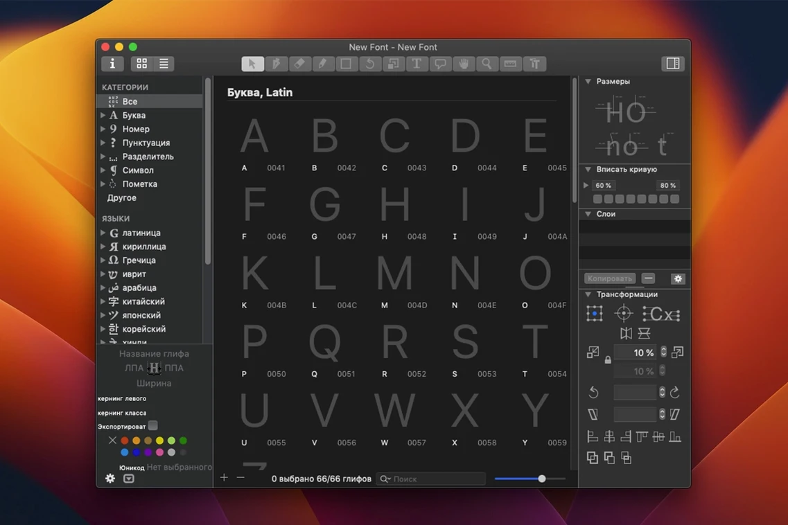
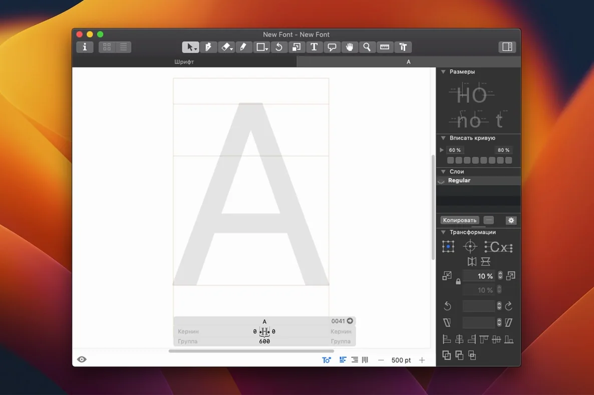
If you've ever nudged bezier curves in Illustrator, the vector drawing in Glyphs will feel immediately familiar. The difference: every point you place builds a working font.
Draw a few letters first
Open a new document and double-click any glyph cell to enter the edit view. Use the Pen tool (P) to drop points and drag handles. Keep the shape simple — a sans-serif 'a' or 'n' is enough. Hit Cmd+Return to preview how the contours render. The real payoff comes when you switch to the Text tool (T) and type with your own shapes live.
Export something small
With even three letters drawn, go to File > Export and pick OpenType (.otf). Install the font on your Mac and set a line of text in Pages or Sketch. You have a pipeline: from blank canvas to system-wide usable font in minutes. Next, try exporting a single glyph as an SFSymbol or SVG to drop into a design mockup.
How Glyphs compares with similar apps
Three serious font editors dominate Mac desktops. They overlap but serve different habits.
RoboFont is the Python scripter's choice. Its UI is a plain window — no hand‑holding, no built‑in drawing‑aid panels. You extend everything through code. Where Glyphs gives you a structured toolset from launch, RoboFont expects you to build your own. Switching between the two often comes down to how much Python you write. Many foundries keep both: Glyphs for fast design and RoboFont for batch‑processing UFO sources.
FontLab 8 feels closer to Glyphs in scope but heavier in interface. It runs deeper on TrueType hinting and legacy format support. The trade‑off: more panels, more dialogue boxes, a busier screen. Glyphs strips the workspace to what you need right now. Beginners usually pick up Glyphs faster; technicians who fine‑tune GDI rendering often stay with FontLab.
BirdFont is the lightweight alternative. It draws well, costs nothing for basic use, and runs on Linux too. But it lacks the scripting layer, the plugin ecosystem and the OpenType feature editor that make Glyphs a production tool. Think of BirdFont as a sketchpad, Glyphs as the workshop where you ship the family.
If you have searched for a Glyphs app free download or a Glyphs 3 free download, you will find older builds floating around. Version 3 still handles variable font axes and masters cleanly, but the 4.x line adds SFSymbol export and a rethought sidebar. The jump from the Glyphs 3 crack Mac scene to a current build is mostly about workflow polish, not a revolution in the drawing engine. What you gain by setting up an older build properly are the smaller quality‑of‑life fixes — better multi‑master interpolation, smoother colour‑font support, faster screen redraw on Apple Silicon.
What to check before you download
Does it handle variable fonts or just static .otf files?
Glyphs builds both from the same file. You design a master for each axis extreme (Light/Black, Narrow/Wide) and the app interpolates the instances. Export once and you get a variable font plus a set of static cuts.
Opening .vfb files requires a UFO detour through FontLab
Glyphs opens .glyphs, .ufo and .otf/.ttf binaries. For FontLab’s .vfb format you export as UFO first in FontLab, then bring that into Glyphs. The round‑trip through UFO is solid enough for production.
Can I work on a font with another designer at the same time?
There is no real‑time collaboration inside the app. The standard workflow: split the glyph set across .glyphs files, merge later with the File > Merge command, or use UFO sources and Git. Many teams pair Glyphs with a version‑control host and a merge‑check script.
Tweak an existing .otf or .ttf directly in Glyphs
Open the .otf or .ttf directly. Glyphs decompiles the outlines and puts them into glyph cells. You can adjust weight, tighten spacing, or fix a single bad curve and re‑export. It works for a quick customisation pass without starting a new document.
Start with a 26‑letter uppercase sans, not a 700‑glyph serif
Starting with an ambitious serif. A 700‑glyph Garamond revival as your first project teaches you patience, but not much else. Begin with a 26‑letter uppercase sans, add lowercase, then diacritics. Ship something small before you tackle the Latin Extended‑B block.
Not setting vertical metrics early. Ascender, descender and x‑height numbers defined on day one save you re‑spacing every glyph later. Use File > Font Info > Masters to lock these in before you draw a single contour.
Forgetting to test in the wild. The built‑in preview is honest, but a font behaves differently in a browser, in Word and in InDesign. Export a test build, install it and set real paragraphs. Adjust spacing in the app, re‑export, repeat. The Text tool is a start; a live document is the real proof.
Ignoring the sidebar's Components panel. New users often copy‑paste outlines when they should reuse a component. Build the base glyph (say 'O') once, then insert it into 'C', 'G', 'Q' as a component. Edit one master shape and every dependent
Build 4200 bundles the developer’s latest round of maintenance fixes and low-level adjustments for a steady, predictable drawing environment.
- macOS 12 or later
- Apple Silicon or Intel 64-bit processor



Comments 0
Sign in or create an account to add a comment.
No comments yet. They go up after moderation.