

GraphPad Prism — Mac download
Download (68 MB) Earlier builds
Ticked
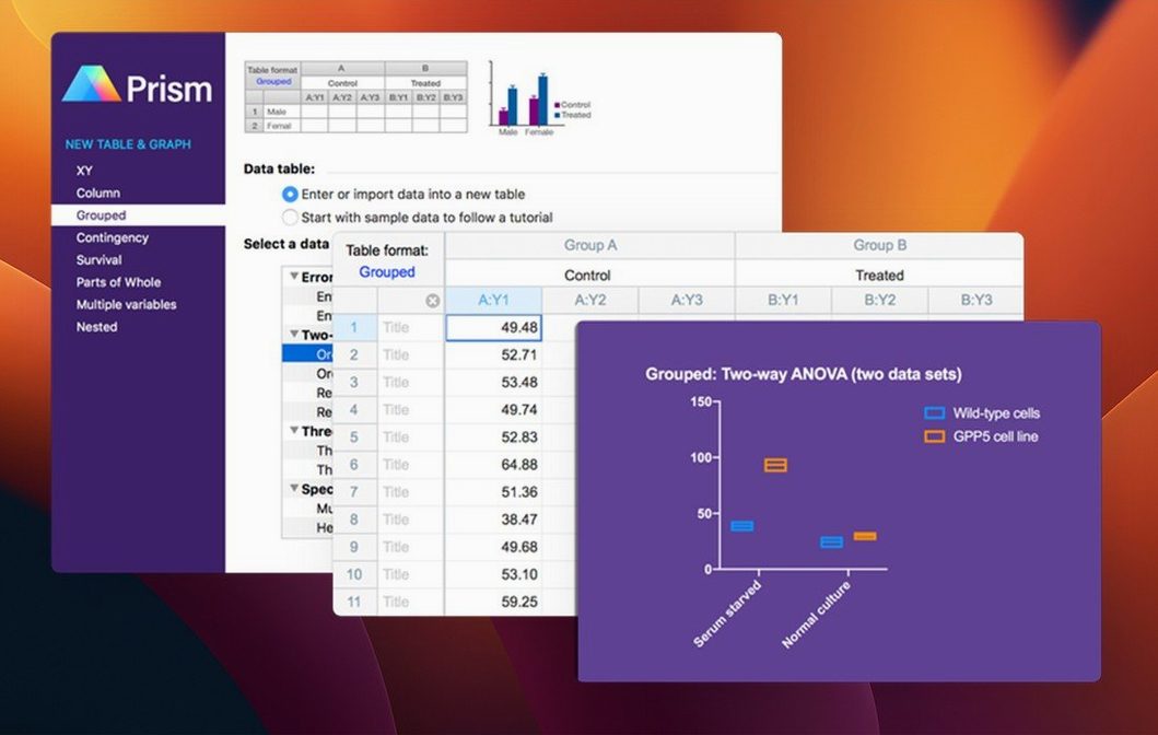
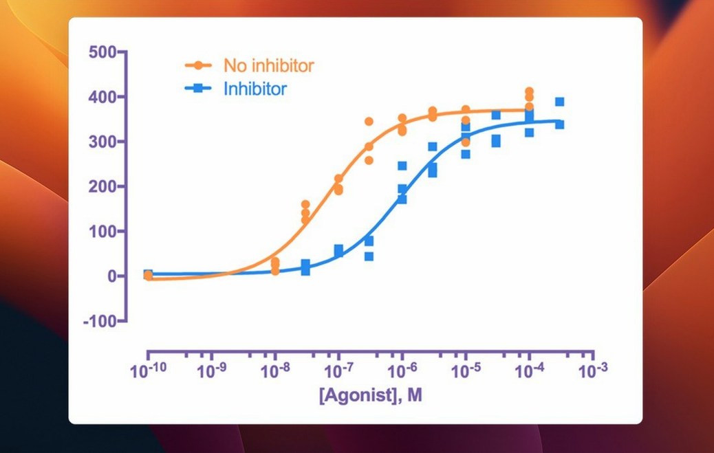
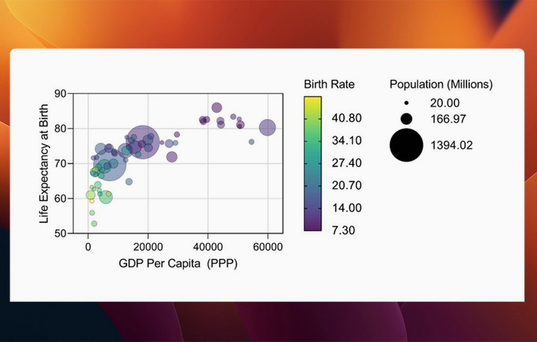
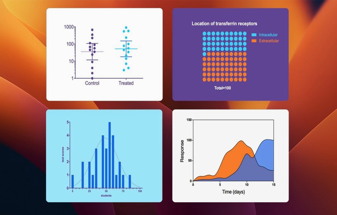
Runs on any Mac with macOS 11 or later — natively on both Apple Silicon and Intel 64-bit processors. A Windows version also exists, but here we focus on the Mac release.
Pick the right statistical test
Prism guides you away from common mistakes. Its built-in tools help you choose an appropriate test and then interpret the results without jumping to a separate manual.
Build graphs from multiple variables
Version 11.1.0 adds graph types purpose-built for multiple variables tables. You can also set categorical level ordering to keep data presentation logical and tidy.
Analyse repeated experiments cleanly
Organise, run analyses and display data from repeated experiments without duplicating work. Variable selection is now streamlined inside the t test, ANOVA, nonlinear regression and simple survival dialogs.
How Prism fits with other Mac apps
Prism works as a hub. It does not try to be a word processor, a presentation builder or a reference manager. Instead it slots alongside the tools you already use.
Export to Keynote or PowerPoint. Copy a graph or layout and paste it straight into a slide deck. The vector format keeps text crisp at any size. For posters and manuscript figures, export as PDF or TIFF without leaving the app.
Pair with a reference manager. Prism’s curve-fitting results and statistical outputs can land in a lab notebook or paper draft alongside citations from Bookends or EndNote. No special plug-in needed — just copy and paste the analysis summary.
Quick Look support. Prism project files preview in Finder. Tap the spacebar on a .pzfx file and see the graphs without launching the full app. Useful when hunting for a specific figure across a folder of experiments.
Workflow: dose–response curve from raw plate reader data
A typical task: a 96-well plate, triplicate treatments, four-parameter logistic fit. Here is how the steps look in Prism.
- Open a new XY table. Paste mean values from your spreadsheet, one concentration–response pair per row.
- Label the columns with treatment names. Prism auto-recognises the X column as concentration.
- Click Analyze. Choose Nonlinear regression. Select log(agonist) vs. response – Variable slope (four parameters).
- In the parameters dialog, check that variable selection picked the right data sets. Adjust if needed.
- Run the analysis. Prism returns EC50, Hill slope and confidence intervals in a results table.
- Open the graph view. Switch to a semi-log scale. Add error bars from the raw data tab.
- Use the Draw toolbar to add an EC50 annotation line. Export the graph as a PDF for the lab meeting deck.
The whole workflow stays inside one project file. No jumping between a statistics package and a separate graphing tool.
Compared with three similar Mac apps
Prism vs. JASP
Good for — JASP: Bayesian statistics, open-source workflow, classroom teaching.
Not for — JASP: publication-ready curve fitting, dose–response models, or building multi-panel figure layouts.
JASP gives you frequentist and Bayesian tests in a clean, free package. It updates in real time as you filter data. But its graphing is basic, and nonlinear regression is limited. Prism’s strength is the tight link between analysis and editable, presentation-grade graphs. If your work revolves around binding curves, IC50s or kinetic models, Prism does in one window what JASP would require exporting to R or Python to finish.
Prism vs. OriginPro
Good for — OriginPro: engineering plots, signal processing, huge data sets.
Not for — OriginPro: guided statistical test selection, Mac-native feel, quick learning curve.
OriginPro is a Windows application first. It runs on Mac via a compatibility layer or virtualisation, which adds friction. It handles massive data tables and contour plots well, but its interface is dense. Prism feels native on a Mac and guides you toward the right analysis instead of presenting every option at once. For a bench scientist who needs a dose–response curve before lunch, Prism is the faster path.
Prism vs. R with ggplot2
Good for — R: reproducibility, custom statistical models, no GUI limits.
Not for — R: quick exploratory graphs, drag-and-drop layout adjustments, a shallow learning curve.
R and ggplot2 can produce anything Prism can, and more. The cost is time and syntax. Prism trades some flexibility for speed: you build a grouped bar chart with error bars in seconds, then adjust colours and labels by clicking, not coding. Many labs use both — Prism for the standard analyses and quick visuals, R for the custom modelling and automated reporting pipelines.
- New graph types for multiple variables tables added.
- Categorical level ordering now available for multiple variables data tables.
- Variable selection streamlined inside analysis dialogs.
- macOS 11 or later
- Apple Silicon or Intel 64-bit Mac
Questions the team asks
Yes, version 11.1.0 runs natively on both Apple Silicon and Intel 64-bit Macs with macOS 11 or later.
GraphPad Prism uses its own .pzfx and .prism file formats, which bundle data, analyses and graphs together in a single project file.









Comments 0
Sign in or create an account to add a comment.
No comments yet. They go up after moderation.